Controller User Interface
From SqueezeboxWiki
Contents |
Squeezebox Controller User Interface
Buttons
This section describes the buttons used on the Squeezebox Controller platform. See SqueezePlay for the mappings of these buttons to keys when running the SqueezePlay software platform on a desktop computer.
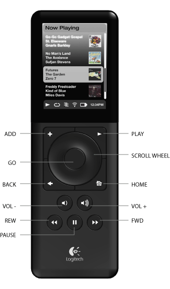
Use the SCROLL WHEEL to navigate within the music library. Rotate the wheel clockwise to select the next item within a list, counterclockwise to select the previous item.
Press GO to go into the selected item or to display additional information about that item. For example, if the selected item is an artist, a list of albums by that artist is displayed. If the selected item is a song title, additional information about that song is displayed. When editing text on the screen, the GO button adds the currently selected letter to the text. Pressing GO again at the end of the text (when the right arrow is displayed) finishes the text entry.
Press BACK to go out of the current list, usually by sliding left.
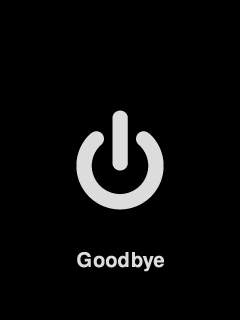
Press HOME to return to the player’s home menu. Once there, press HOME again to display the Now Playing track. While in Now Playing, press the Go button to display the Now Playing playlist. Items in the playlist can be deleted by pushing ADD while highlighted. Turn off the Controller by pressing HOME for at least 5 seconds. If the Controller is stuck, pressing and holding HOME for 10 seconds will force a power off. If the Controller is powered off, press HOME to power it back on.
Press PLAY to play the songs contained with the displayed selection. If you press PLAY while displaying:
- Genre, artist or album – Player plays all the songs for the displayed genre, artist, or album.
- Song – Player plays that song. If that song is displayed within the rest of an album, the whole album is played, starting at the song on the display.
- Playlist – Player plays all of the songs in that playlist.
- Folder – Player plays all songs in that folder and subfolders.
When the selected item is not playable, the PLAY button should function as a GO button. When editing text on the screen, the PLAY button acts as a backspace.
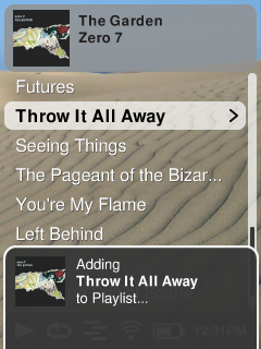
Press ADD to append the displayed selection to the end of the current playlist. Press and hold ADD to play next. If you press ADD while displaying:
- Genre, artist or album – Player adds all the songs for the displayed genre, artist, or album to the end of the Now Playing playlist
- Song – Player adds that song to the end of the list.
- Playlist – Player adds all of the songs in that playlist.
- Folder – Player adds all the songs in that folder and subfolders.
When editing text on the screen, the ADD button will insert a space character.
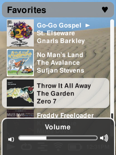
Use the VOL+ and VOL- buttons to adjust the loudness of the audio being produced and display a pop-up indicator of the volume level. (While the volume indicator is visible, you can use the scroll wheel to directly adjust the volume.) The indicator will disappear after one second of inactivity.
Press REW to immediately begin the current song again. Press REW twice to skip to the previous song. Press and hold REW to scan backwards through the current song. Icon on status bar switches to REW to reflect state.
Press PAUSE to pause the current song.
Press PAUSE again to continue. resume playback. Press and hold PAUSE to stop playback. Icon on status bar switches to play or pause icon to reflect state.
Press FWD to skip to the next song. Press and hold FWD to scan forward through the current song.
Special Button Functions
- Hold down the ADD button at startup to do a factory reset.
- Hold down VOL+ at startup to switch to the previous firmware version.
- Press and hold PAUSE and REW together to take a screenshot. Screenshot files are saved as .bmp in /usr/bin.
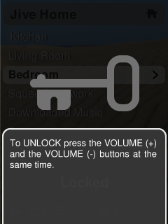
- Press and hold ADD and PLAY together to lock the keys. Press and hold again to unlock (when locked and the user presses a key, display in an overlay: “Press and hold both volume keys to unlock.” When keys are locked, the backlights should remain off at all times, except when the ADD and PLAY keys are pressed together.
- Holding ADD and > turns off the accelerometer (the thing that wakes the remote when you pick it up). Pressing any other button escapes this.
Screen Layout
Title Bar
The title bar at the top of the screen shows the context for the content below, typically the name of the artist, album, genre, etc. The title bar may contain a thumbnail of cover art when the list below is an album.
Content Area
The content area usually contains a list of items that can be selected, but may also contain widgets for editing text or displaying cover art. The content area may have a scroll bar on the right side to indicate a scroll position in the case that there is more content than can fit on the screen. The scroll bar should be hidden when the content fits on a single screen.
Explanation Panel
At the bottom of the screen there may be a panel that overlays the content and status bar and contains additional information or explanations about the content on the screen. The explanation panel may also contain two indicators that show the functions of the ADD and PLAY buttons in the case that they are used for additional functions (such as insert and delete characters in the text editing widget.)
Status Bar
The status bar appears at the bottom of the Controller screen. This bar is usually visible, but is hidden when a explanation slider is visible. The status bar may contain a number of icons or elements, including:
- Play/Pause – A play icon is displayed while the player that the Controller is controlling is playing back audio. It is replaced by a pause icon when the audio playback is paused. When stopped or not connected to a player, no icon is displayed. This icon may briefly change to a ffwd or rew icon when fast-forwarding or rewinding.
- Shuffle – A shuffle icon is displayed when the connected player is set to shuffle song or albums.
- Repeat – A repeat icon is displayed when the connected player is set to repeat songs or playlists.
- Wireless – A wireless icon is displayed to indicate the quality of the wireless connection. Possible states are:
- Full strength wireless connection
- High strength wireless connection
- Medium strength wireless connection
- Low strength wireless connection
- Wireless connection out of range or unavailable
- Error connecting to wireless connection (encryption error or other)
- Battery – A battery icon is displayed to indicate the status of the internal Controller battery. Possible states are:
- Battery full
- Battery high
- Battery medium
- Battery low
- Battery charging (this is an animated icon, looping through low to full battery charge indicators)
- Battery charged and device in cradle
TODO – Include sample graphics of the icons.
Sound Effects
The Controller’s internal speaker can make subtle sound effects based on user activity. Sound effects include:
- Click sound when scrolling through a list
- Whoosh sound when animating right into a new list
- Reverse-whoosh sound when animating back, out of a list
- Jump sound when jumping home (or into Now Playing when pressing the HOME button a second time)
- Select sound when switching settings on/off, or to confirm some other action (like ADD, but not PLAY)
- Startup sound played when starting up device
- Shutdown sound played when user turns off device manually.
- Docking sound played when the device is placed into the dock and charging has begun.
No sound should be made when
- adjusting the volume
- playing a track
- skipping tracks
- pausing/unpausing
- sleeping/waking from sleep
Sound effect volume can be controlled in settings and sounds may be disabled altogether.
TODO – Include sample sounds in the electronic version of this document.
UI Guidelines
User Interface is modeled after Squeezebox UI:
- Top line shows context or title of the list below
- Below this is 5-8 lines of items in list current list context, some with icons/graphics.
- Status bar at bottom of screen
- Play/Paused icon
- Wireless signal strength
- Battery charge level
- Clock
- Sleep countdown timer
- Status bar can be hidden on a per screen basis (like hiding navigation bar in HTML)
- Status bar can be replaced by soft-key labels to describe alternate functions for ADD and PLAY
- There is no power button. Screen dims after fixed time (5-10 seconds, customizable). Shutdown/power off via Settings button menu.
Alert Windows/Popups
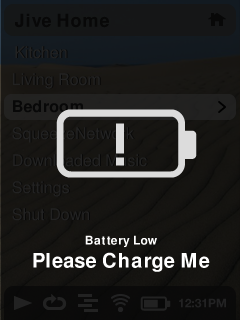
This is a list of all of the places that we’ll need a popup or alert notification for the user. It’s based on all the places that we have “ShowBriefly” on Squeezebox* . There are two different kinds of "showbriefly" temporary displays. Full screen warnings with the dark background or a brief pop-up notices.
The full-screen warnings should only be used when the users experience is stopped while something big happens. Examples include searching for networks, sleeping, running out of power, confirming deleting playlists or favorites etc... Essentially we want to grab the user's attention and force them to notice that they can't just skip it and possibly make a decision. In the case that the user needs to make a decision, we can use the two button indicators at the bottom to prompt them to choose one of two items. They may be cancellable by pressing the BACK button, but in some cases, like when we run out of power, they may not be.
The pop-up notices are used to give feedback based on some user action. Examples include the volume feedback indicator, adding tracks to the playlist, saving a favorite or skipping tracks. These stay up for a second or so after the user completes the action. If the user presses another button, they are dismissed.
Pop-up notices
Pop-up notices show feedback for a short amount of time (a second or so) to confirm the action that a user has taken, such as:
- Playing, adding, deleting or inserting music into the playlist
- When creating a mix
- When adding or deleting a favorite
- Skipping forward/back
- Pause/resume/stop
- Sleep/cancel sleep
- Adjusting Volume/Bass/Treble
- Errors opening or playing tracks or stations
Press the VOL+ or VOL- buttons to adjust the volume at any time. A popup window is displayed for a second after each button press. While the popup window is displayed, you can use the scroll wheel to adjust the volume directly.
Full Screen Warnings
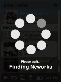
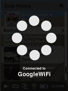
Additionally, there may be a progress/wait indicator when some operations are happening:
- Searching
- Connecting to a stream/remote service
- Rebuffering
- Upgrading firmware
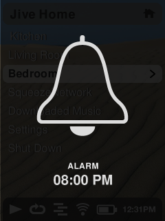
- When the alarm goes off
- Pressing and holding the home button (to sleep, power off)
Confirmation of data loss
When an action can result in data loss, the user should be prompted to confirm the action. For example, deleting a playlist or favorite. In this case a the user should be prompted with a standard list of items, where the first and default selection is "Cancel" and the second and possible subsequent items are the ones that may lead to loss of information.